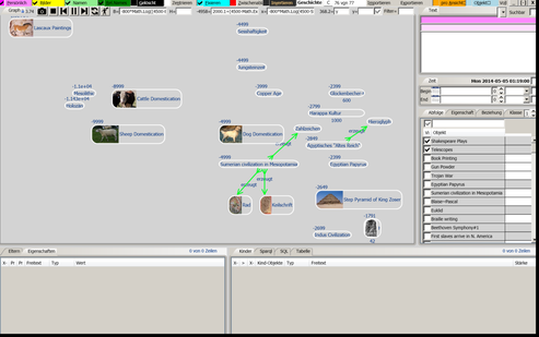
The Spoc-Web GUI consists of so-called Views. Each View opens in its own Window, so You can have multiple Views from the same Database open in the same Process. The Application ends only after the last View is closed.
The largest Part of the View is the Graph, a Canvas where You can place Nodes, Graphics and Drawings. Other Parts are the Menus, Filters, Query Panes, Descriptions, Properties, Parent and Child Relationships.
Spoc-Web Views show Sets of Things

On Startup, Spoc-Web opens up the last closed View.
A View, like the one to the right, initially empty. But can be filled with Things by searching or creating them in the View. All Things are shared globally between all Views and can be added to any Number of Views.
Apart from hosting different Nodes, Views have individual Settings for Filtering, Display and mathematical Expressions to arrange Nodes. Views are also Things in Spoc-Web, in fact each Thing/Object in Spoc-Web can have its own View. It is opened by clicking on the middle Button of the Node marked with either
▢ when a Window already exists or
* if it should be created
Views can be used to
- explain the associated Thing or
- define the Elements if it describes a Set
View can be removed independently of the associated Object, e.g. when accidently created. But when the associated Object is deleted, the View is also destroyed. For the View Background You can choose between a lighter and a daker Shade of the Node Color. Alternatively, You can also make the View transparent, so You can seamlessly work with a second Application in the Background.
Spoc-Web Nodes show a single Thing

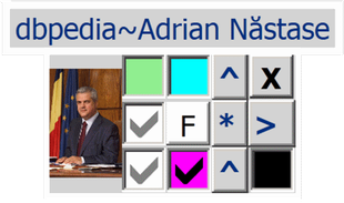
To the right You can see a typical Node imported from Wikipedia. The Checkboxes only appear when it has the Focus:
- Mouse Focus is applied when the Mousepointer hovers over the Node
- Keyboard Focus is changed only by Navigating to or clicking on Nodes
Each Thing/Object in Spoc-Web can have its own View. It is opened by clicking on the middle Button of the Node marked with either a Star or a Square:
▢ when a Window already exists or
* if it should be created
Focus-sensitive View-Controls
These dockable Spoc-Web Application Tabs change Content with the focused Node:
- Properties: lists all Properties of the focused Object (including deduced Table Cell Values)
- Children: lists all Child Nodes of the focused Object
- Parents: lists all Parent Nodes of the focused Object
- Text: allows to edit the private, internal and public Text Description
Powerful Filter Settings
The following dockable Tabs allow to filter the Content displayed in the View:
- Property: lists all Property Types to control their Visibility
- Class: lists all Classes Nodes to control the Visibility of their Instances
- Relations: lists all Relation Types to control their Visibility
Spoc-Web Node Controls

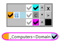
When a Node is focused, additional Controls appear to manipulate it. Their Function is explained in the Image to the right.
Most Controls can also be triggered by the Keyboard.
Especially important are the ^ and > Controls to show or hide the Parent/Object, Child/Subject or Neighbor Nodes.

These Node-Checkboxes have Counterparts in the Menu Bar, where they are set globally, while they can be overridden locally for the current Node using these Checkboxes:
✔ Name left (or above as shown)
✔ Show Icons (initially takes a while)
✔ Show Neighbor Icons (only when Name left)
✔ Delete the Object (global)
☑ Freeze Node Position
☑ Privacy of the Object (global)
☑ View specific Check (local Value, specific per View)
☑ Object Check (global Value, same on any View)
Spoc-Web Menu Items
These Menu Items are available in every Spoc-Web View. Most of them have an associated Check-box to toggle between✔two States or...
☑three States:
| ☑Private | ✔Icons | ✔Names | ✔Rel.Names | ✔Deleted | ☑Center | ☑Freeze |
|
Show Private Internal Public |
Show or hide Node Icons | Show Node Names above or next to Icon | Show or hide Relation Names | Show or hide deleted Nodes |
Center on focused Node |
Freeze Nodes Snap to Grid Free Moving |
| ☑Clipboard | ☑Invert | Node Name | Main Menu | Import | ☑Window | ☑Object |
| Watch Clipboard to create Things |
Darker Transparent Brighter |
The Node Name to identify the View | Core Menu Items | Import and Export Menu | Show View- specific | Show global Checkbox |


